Falkirk Crests
Part Four - The Steeple
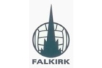
 The crest to the right was the first version of the familiar logo that we see on Falkirk strips, programmes and other such paraphernalia. The design is a simple one - a silhouette of the town steeple superimposed upon a football. It is said that club secretary, Willie McFarlane, used a sixpence as a template to draw the circle of the football. The crest first appeared in 1970 and remained unchanged until the early 1990s when the increasing use of computers saw slightly altered digital versions make an appearance.
 The first change in design of the steeple crest came in 1992 when then chairman Hamish Deans felt the club needed a more modern version as football entered the business age. The new design saw the silhouette of the steeple atop a more modern looking football. Changing the design was controversial and the logo was disliked by the fans. This logo never really took off and appearances of it began to peter out around 1995.
 The most recent change in the steeple crest took place at the start of season 1998-99. Again the crest was redesigned because it was felt that the 1970s version was looking a bit outdated. This time the design was more successful. The 'Est. 1876' part was removed, the height of the steeple shortened and the word 'FALKIRK' included along the bottom of the crest. This crest is now established as the club's brand.